Two things became clear to me in the summer of 2008:
1. My business was failing; and
2. I needed to get a job.
Finding a job wasn't easy. The Great Recession didn't help matters, but the real problem was with me, not with the economy. I was a jack-of-all-trades with a confusing résumé.
Then, it struck me: I should get a job in advertising. Ad agencies are the jack-of-all-trades of the corporate world. They work with all kinds of clients. I figured that a creative director wouldn't care about my résumé if I had a good portfolio. So, I whipped together a "book" of spec ads.
I didn’t know it then, but a good advertising portfolio:
Demonstrates a range of creative thinking;
Features ad campaigns, not a scattershot of one-off ads;
Invites no comparisons to famous or award-winning ads;
Uses simple concepts to break through language barriers;
Makes boring products and services look exciting; and
Avoids marginalizing or insulting any person or group.
Alas, my portfolio failed at most of these points. I was lucky that a recruiter took pity on me. She recommended that I take a class with Kash Sree, who was then the executive-creative-director of J. Walter Thompson. Kash took no pity on my work, but he was generous with his time and he helped me see the shortcomings in both my work and my thinking. Those lessons were invaluable and they marked an inflection point in my career. I eventually became a marketing executive.
Because I enjoy sharing my own mistakes, here is the spec portfolio that didn’t get me hired:
eBay
This is the best spec ad in my portfolio (although the copy is a little clunky). "At least you can sell it on eBay" is an extensible concept that can be stretched into a campaign.
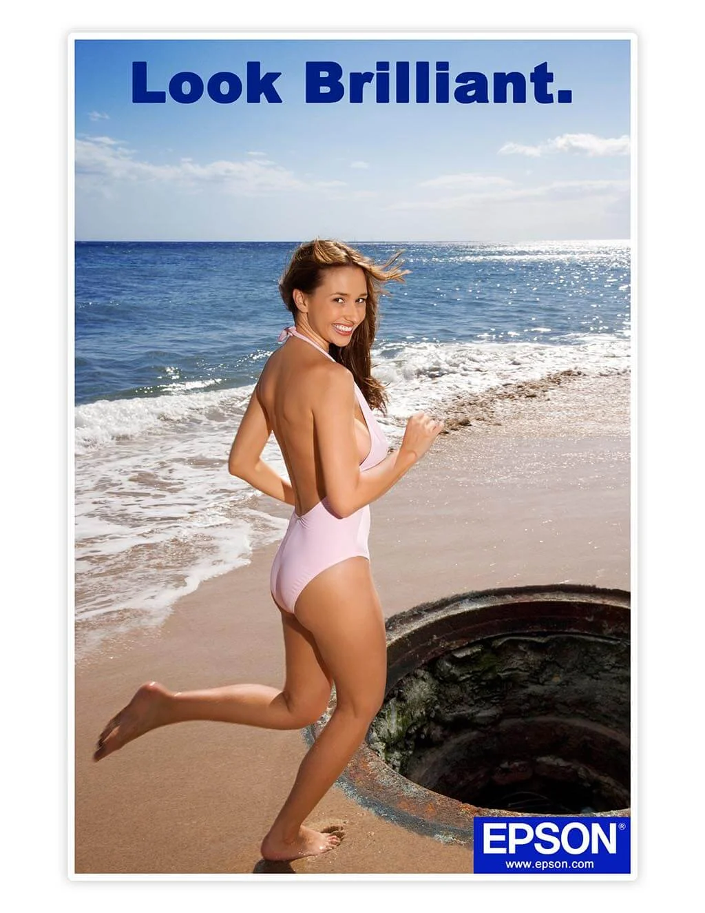
Epson
"Look Brilliant" works a double entendre, but the older I get, the more I hate advertisements that mock or trivialize people getting hurt.
Ford
I registered www.howfarcanigo.com to host a Google Maps-powered tool that highlighted road-trip destinations that were drivable on a single tank of gas. No one found the idea as cool as I did.
Friskies
Never use two pages to accomplish what can be done on one: It's a cardinal sin of print advertising.
Miracle-Gro
Another cute, but not that clever, and definitely not clever enough for two pages ad.
Museum of Sex
I tried to spin this stock photo into my own concept, which is just plain lazy.
Hummer
This parodies the ad that made Volkswagen famous in the U.S. (Unfortunately, most people couldn't be expected to know that.) Interestingly, this ad presaged the Volkswagen emissions scandal.
Sugar Daddy
I love how expressive this model is, but there isn't enough here for a campaign.
Timex
Timex is too recognizable a brand to make a mark with, let alone with a one-off ad.
Truth
Truth is another organization with a huge portfolio of award-winning ads: the type of brand that shouldn't appear in most student portfolios.
Windex
I was surprised at the lukewarm reaction that this ad received. I've never seen a transparent Windex ad, or any transparent ad for that matter.
World Wildlife Fund
This Lorax-inspired ad might get someone to look at it, but I doubt many people would walk away with a call to action. It's a dud.
X-Acto
The ad with the pencil sharpener should have a headline made from pencil shavings, not cut-from-magazine letters. Lazy work.


